
Timeline
Sep 2022 – Dec 2022
My Role
UX Researcher
UX Designer
Team
Anna Shulpina
Samarth Nayyar
Yiwei Wu(Me)
Gayathri Ramesh
Fanyi Zeng
Tools
Figma
Figjam
Sketch
Problem
We live in a digital world with emerging technologies. More and more people choose to record their life using their phones photo/video taking function. Despite the variety of different photo and video-taking applications on the market, very few help users take better photos and videos through real-time feedback and suggestions. Currently, most of the suggestions for enhancing the photo/video comes after it has been captured in the "Edit" mode. However, these apps miss including the suggestions during the most critical time of the photo/video taking experience, i.e., when the photo/video is been captured.
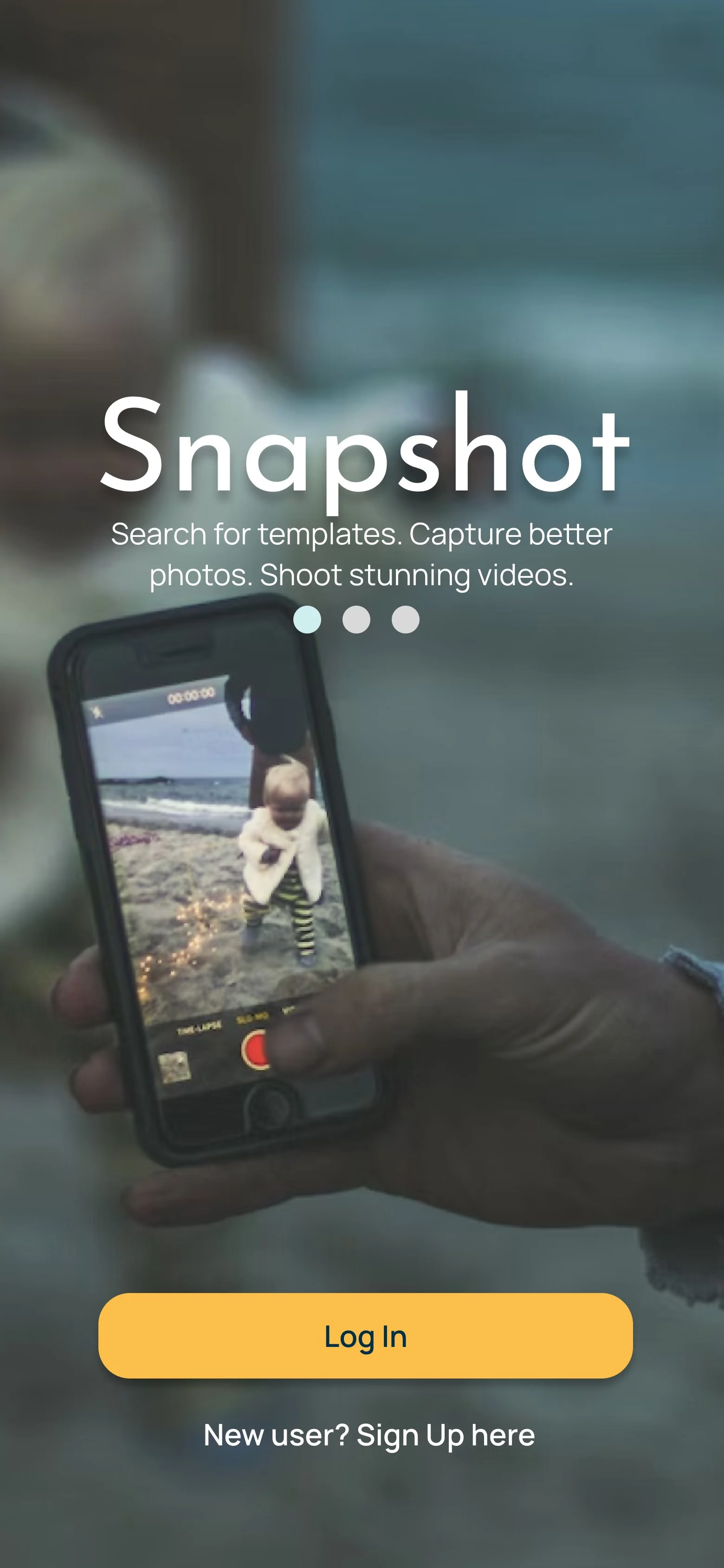
Solution
Our solution, Snapshot, is an intelligent camera app that would provide templates, real-time feedback and suggestions to help users take better photos and videos. Through Snapshot, the user can recreate popular poses, photos, videos and movie moments in particular locations and scenes. The app would provide real-time recommendations that assists users while they're taking a photo/video to get the perfect shot.
Process

Ideation
The idea of this application arose during our first meeting with the team. We decided we wanted to design an application all of us would enjoy working on. Thus, we each voted for a certain topic we had interest working on. The three topics of interest we landed on were: music, photography, and movies.


We synthesized interview results by making the Affinity Diagram to organize the interview results to see any potential pain points and opinions users have about current photo/video apps.

User Research
Initial Interview
We began our project by conducting interviews with 10 participants of our target audience - individuals who take photos and videos. For the most part, these individuals were friends and family. We talked to people with varied levels of expertise in photography as we wanted to get a broad understanding of how people take photos. Our main goals were to discover pain points people came across when taking photos and/or videos and what improvement could be made to their current experience.
Survey
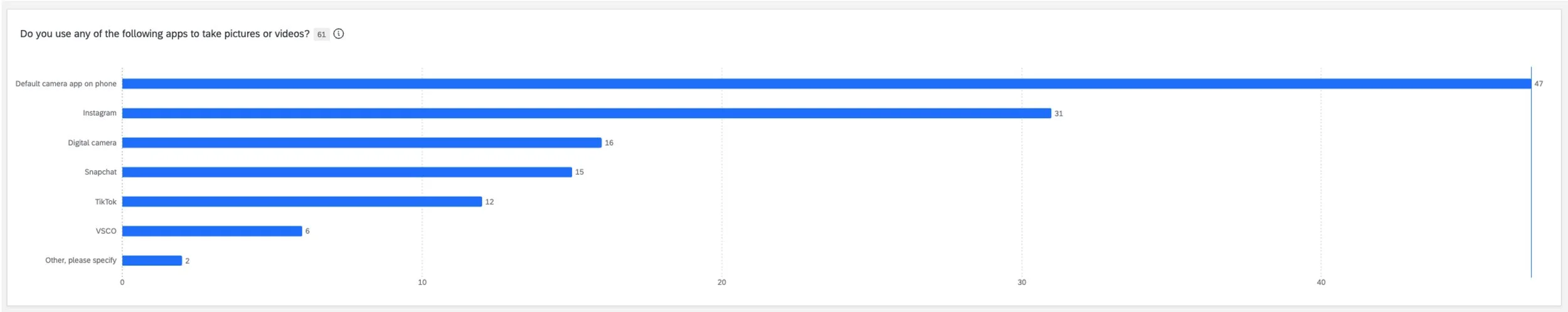
To help narrow down the list of desirable features our app would include, we designed a survey in Qualtrics that we distributed to friends, across various Facebook groups, and more (we collected over 80 responses!). Our survey consisted of 4 main questions asking people:
What apps they use to take photos/videos
What their main goals are
List of features they would like a photo/video-taking app to have
A question ranking those selected features in terms of priority
Affinity Diagram- Link
Just like from the interviews, we learned that for the most part, people enjoy taking videos and photos primarily on their phone to remember a moment by sharing them with their friends and family.
We decided that features that were selected by 20+ people were ones we would definetely have in our app and those with less than that we would consider. There were 9 features we knew we would need to include in our app. These were:
image/video stabilization for shaky hands
photo/video editing settings (saturation, exposure, contrast)
auto-focus on target being captured
remove background noise from photos
real-time angle/posture/composition suggestions
automatic flashlight in low-light conditions
share with family/friends
scenery enhancement for taking photos/videos of landscapes
filter recommendations for photos/videos
Although photo/video templates for recreating famous photos and videos was not a feature selected by many, out of those who did select it, 38% deemed that feature as a high priority. Because of this and the fact that this feature would help us differentiate on the market, we decided to keep this feature.


Competitive Analysis

While the survey was collecting responses, we conducted a competitive analysis to look at what other competitors on the market were doing. Specifically, we took a look at photo/video-taking applications. We started with the more popular ones like Instagram, Snapchat, TikTok and VSCO. With additional research, we discovered less-popular applications AiryCam and Ulike, both applications from which we took inspiration in particular for pose guidance.
Design and Prototype
Brainstorming: Crazy 8s
Based on our research - interviews, survey and competitive analysis, we each had an idea of what the app would look like. However, not all of our ideas aligned and we struggled to fully envision our app. So, we decided to do a crazy 8’s activity. In this activity, each member of the group had a piece of paper divided in 8 sections. Each person had exactly 8 minutes to draw 8 screens of the app. We then each presented our ideas to the team, giving an overview of what each screen would include.
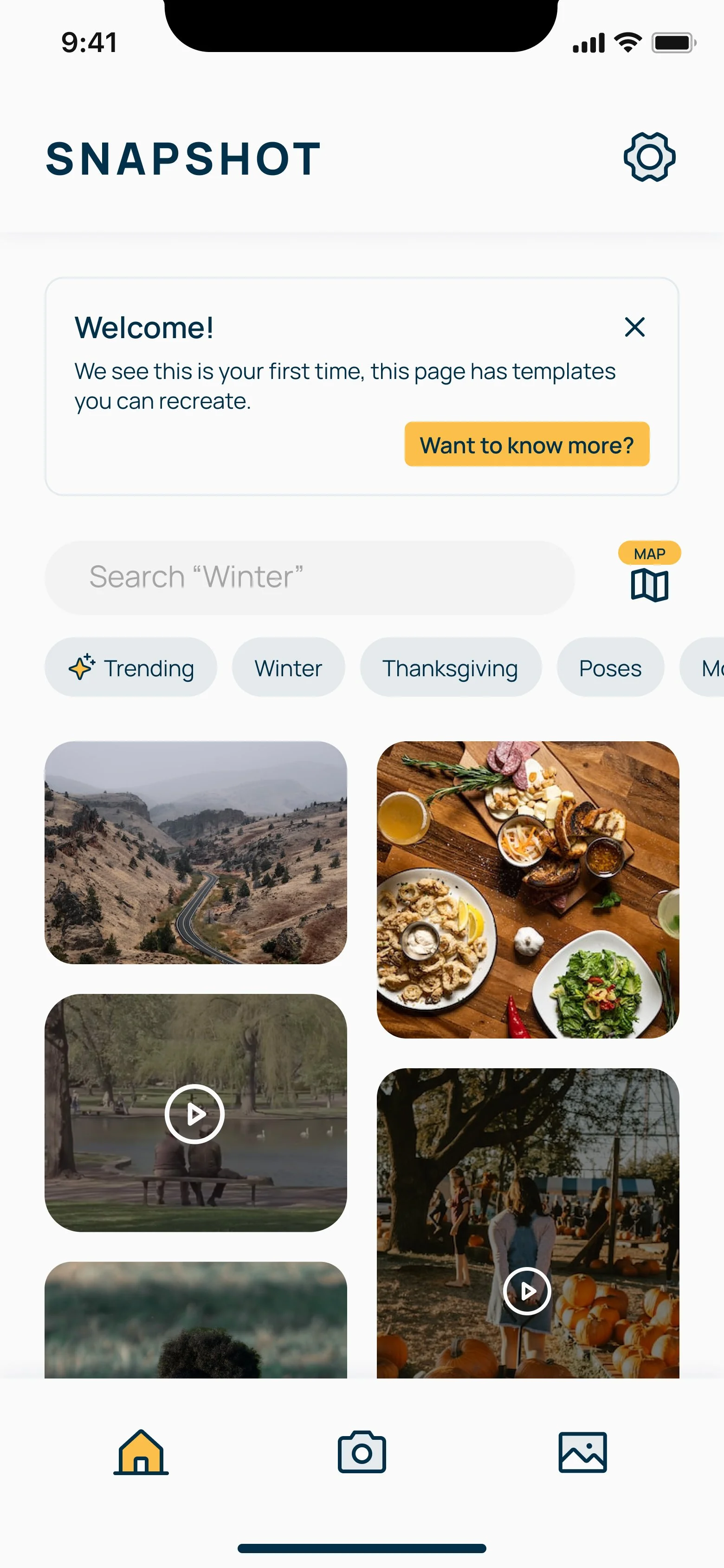
Doing this helped us align on the key features and screens of the application. This would include, most importantly, a camera flow where the user would take pictures using templates, a search functionality for finding templates, and a map allowing the user to find templates based on their location.
Using these as inspiration, two team members went on to design the first wireframes of our application.

Creating initial wireframes
The two team members went through all the drawings from the crazy 8’s activity, the survey and the interview findings to plan out wireframes for the flow of the whole application.
They first went through all the rough wireframes to find out any similarities and differences, then combined and refined these ideas together by listing out the user flow. One team member was responsible for expanding the user flow by formulating potential ideas and rough screen scenes, while the other team member refined these ideas by drawing wireframe screens out on an iPad. This process also included ideation on current screens and research on similar applications to see what users are currently used to.

Concept Testing
To understand whether there is value in our ideation, we wanted to set up the environment loosely to allow for open feedback from the participants. Our implementation for concept testing were hand-drawn sketches to communicate to participants that this is a "work-in-progress" idea.
Process
The moderator then shared each screen at a time and asked participants to take a few moments to see the screen and think-aloud. Based on their feedback, the moderator would ask follow-up questions if needed. This was repeated for getting feedback on all the screens. For this concept test, our participants were:
3 previous participants from the initial interviews (for longitudinal measures)
7 new participants
Synthesis & Analysis
From the concept test we learned that people liked our idea, which would be useful for:
those who are not good at posing, taking good photos, or for those who aren not very creative
spot recommendations and bookmarking
However, most participants want features to be kept as simple as possible.
We also learned that people like the idea of recreating famous movie scenes but that the app shouldn’t focus solely on that idea. If the templates would be based off other things like pose recommendations in general, people would be more likely to use it. With that in mind, we went on to designing and improving the fidelity of our screens.


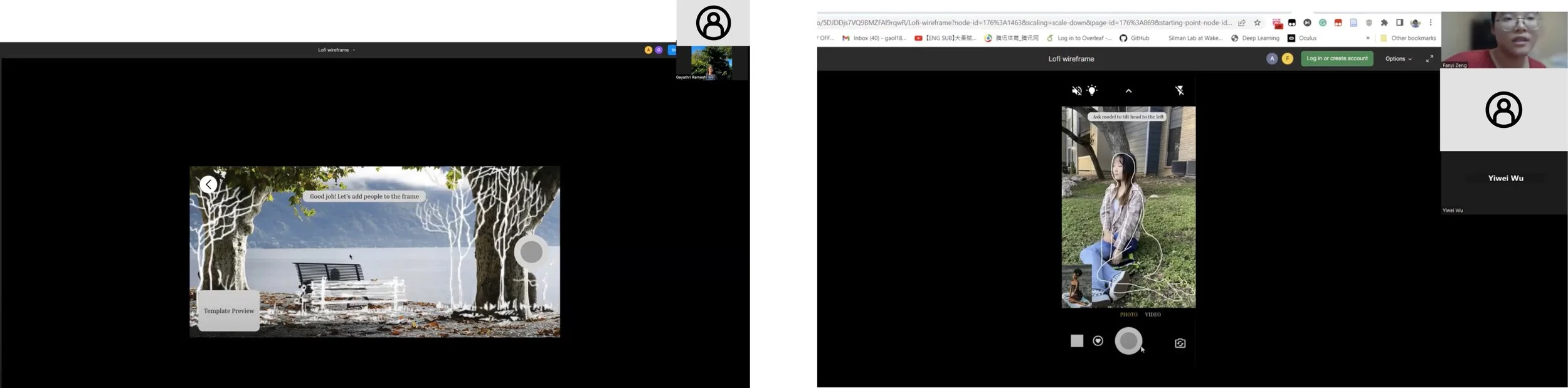
Lo-Fi Prototype
Team members individually went off to design a higher fidelity version of the wireframes to explore various possibilities for the application.
This included taking inspiration from:
Instagram map to show pictures and videos taken in various locations
Airy Cam on pose instructions
Ulike on pose outlines
TikTok and Pinterest to include a home page for template recommendations
iOS default camera to observe where to set up suggestion tip bars while not blocking user’s screen of photo/video taking
Pinterest of adding features of favorite/saved templates
Additionally, broadening the selection of templates to poses, events, scenes, and objects.

Reflection on Design Flows
Although we had ideas for specific screens in mind, we still had to figure out the user flows for each part of the application. To do so, we met up to discuss features and functionalities more in-depth.
We went through the design suggestions and concept test results, dividing the application based on task flows:
Home/Search/Map/Profile
Video flow
Photo template/camera flow
Edit/Share screen
We then drew out the flow screens on a whiteboard to discuss specific features we should keep, add, or delete based on concept test results. We also used sticky notes to organize ideas or questions that arose during the group discussion.


Mid-Fi Prototype
Although we had ideas for specific screens in mind, we still had to figure out the user flows for each part of the application. To do so, we met up to discuss features and functionalities more in-depth.
We went through the design suggestions and concept test results, dividing the application based on task flows:
Home/Search/Map/Profile
Video flow
Photo template/camera flow
Edit/Share screen
We then drew out the flow screens on a whiteboard to discuss specific features we should keep, add, or delete based on concept test results. We also used sticky notes to organize ideas or questions that arose during the group discussion.

Implementing & Testing
Mid-Fi Design Implementation & Testing
After getting aligned on which screens were linked, we began to create prototypes based on specific user flows. Before moving on to creating higher fidelity screens, we knew we needed to test these with participants for feedback.

Moderated Usability Testing
Because these screens were mid-fidelity and we needed a lot of feedback, we conducted moderated sessions so that we could ask follow-up questions to better understand the participants' experience. We used Zoom and Figma to do so, encouraging participants to think aloud throughout.
For this testing, we had 6 participants:
3 old participants (from initial interviews)
3 new participants
There were a series of 8 tasks the participants completed, which were (in general):
Register as a new user
Find a photo template
Use the template as guidance to take a photo
Edit the photo
Share the photo through Instagram
Recreate a movie scene using a template
Find and save templates based on your location
(same task as 7 with a difference in either denying or accepting the use of your location)
Each session had a moderator and a notetaker. The participant was shared the Figma prototype link to go through each task and later answered some follow-up questions and filled out a SUS questionnaire to see how usable our prototype was.
Synthesis & Analysis
Based on the interview notes, we went over the feedback for each screen to analyze what needs to be worked on for the next iteration.
While talking with our participants, we found that people had trouble with the following:
understanding what exactly needs to be typed into the search bar, as our placeholder text “Type anything” was not descriptive enough
knowing how many steps are in the camera flows
some of the real-time feedback in the camera flow were unclear
people couldn’t browse locations in the map
With this in mind, we made changes by
adding specific instructions like “Search Barton Springs”
adding a progress indicator on the flows
adjusting real-time feedback to make them more clear
adding a browsing function in maps
System Usability Scale (SUS) Questionnaire
For our Mid-Fi usability test, the overall average SUS was calculated based on 6 participants scores (both old & new participants).
The SUS for our Mid-fi design was 76.25. A SUS score of 68 is typically deemed as average usability. Based on this information and feedback from participants, it seems that the mid-fi design was usable but there was some work to be done. Thus, we continued to improve the app experience by working on the feedback and increasing the fidelity of the design.

Hi-Fidelity Design Usability Testing
We began to produce a hi-fi prototype design by first creating a design system our team could use.
Design System
For the design system, we reviewed colors camera phone apps used and found color palettes we each liked. From those, we found one we all like in particular:
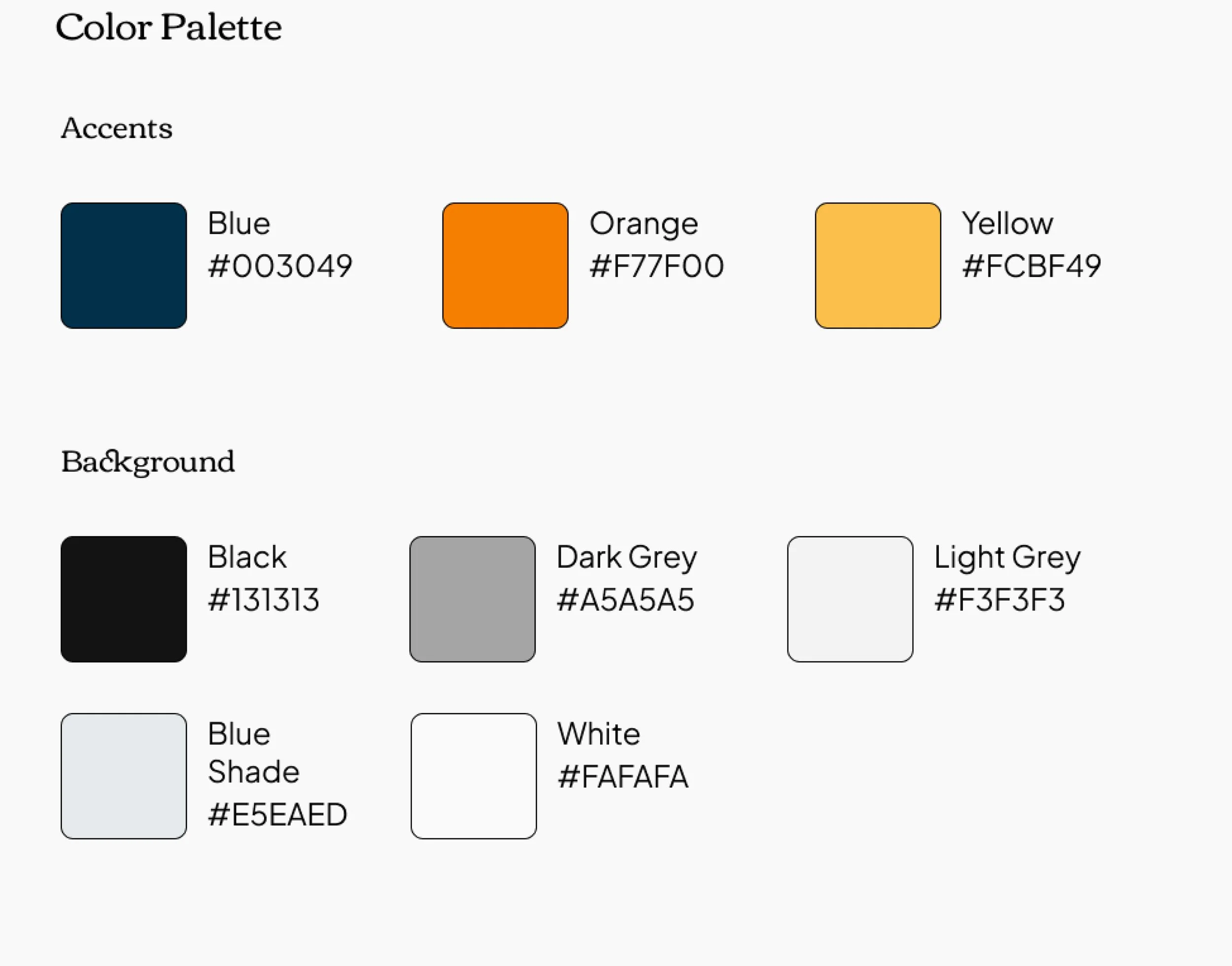
We used Phosphor icons for our iconography and developed a general components system as well.

Design Iteration & Prototype
Using the this newly-established design system and insights found from the mid-fi usability testing, we designed high-fidelity screens.

Unmoderated Usability Testing
We used UserTesting.com to conduct unmoderated usability testing since we gathered a lot of quality feedback in our past sessions and only wanted to observe our improvements at work. For this unmoderated testing, we had 10 participants:
3 old participants (from initial interviews)
7 new participants (through UserTesting)
These were the three tasks we had users complete:
You and a friend are at a pumpkin patch for Thanksgiving and they want you to take a video for them. Use the Snapshot app to help your friend record that moment.
You and a friend are exploring Austin for the first time and are visiting Zilker Park. She would like you to take a photo of her sitting on the lawn in the park. Use the Snapshot app to find Zilker Park and capture a photo of your friend.
You would now like to edit the photo you recently took using the monochrome filter and share it as an Instagram post.
After completing these three tasks, participants were given a few post-task and post-test questions, including filling out a SUS questionnaire.

Findings
Overall, we had great feedback from the participants and some even wanted to see this app implemented! There were still a few things we needed to improve on. This included:
removing the automatic switching of the steps and screens in the camera flow, as participants wanted to click through and read the instructions given
adding a description of what templates were, as participants were unclear what the images were on the home page
refining real-time feedback, as some was still not clearthe “checkmark” button, indicating that a user was done editing was not clear, so we added the text “done” next to it

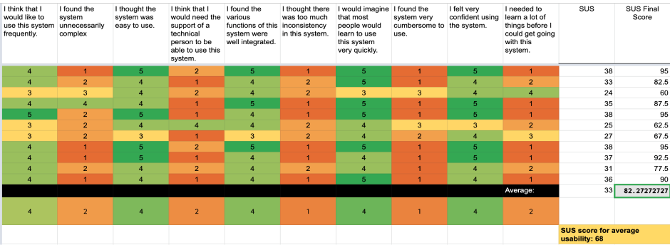
System Usability Scale (SUS) Questionnaire
For our Hi-Fi usability test, the overall average SUS was calculated based on 10 participants scores (both old & new participants on UserTesting). It is to be noted that this test had 3 tasks that the participants had to work on, which is lesser than the Mid-Fi usability session.
The SUS that was calculated for our Hi-Fi design is 82.27. A SUS score of 68 is typically deemed as average usability. Based on this information, it seems that the hi-fi design was usable. However, we want to improve the app experience by working on the feedback to ensure that the app is cohesive.
Final Prototype
From the findings we discovered by testing our high-fidelity screens, we made changes to our screens, producing our final prototype:


Lessons Learned & Conclusion
Enjoy the process! 😊

We began this project by voting on topics we all had interest in, which meant each team member would be invested in the project and have fun throughout. We took that general guidance throughout the whole process, enjoying each part of the process and learning new things along the way.
Takeaways ✨
We learned to make instructions clear. Use simple, everyday language whenever possible. In cases where we must use technical terms (such as “templates”) to refer to features, we need to introduce the term to the users before asking them to use the feature. It is also important to let users know that some sections that are not included in the task flow might not be clickable, otherwise users might get confused and sidetracked.
We not only learned from each other, but we also learned from the process of collaboration. We come from different backgrounds, and thus we bring diverse skills, experience, and perspectives to the table. Therefore, it is important to know when to actively listen and when to speak up. When disagreements arise, we learned to first acknowledge each other’s viewpoints, then raise our questions or express our concerns, and finally try to find the middle grounds.
Limitations 🚦
Some limitations with our project exist. These include:
Not being able to test a wide range of participants due to time / budget constraint - most were our friends and family members.
Not being able to create or mimic the real app in prototype flow due to technical limitation. We can only ask participants to click through the screens with instructions, instead of testing the app through actual photo/video taking.
Not having enough number of contributors for user testing to buffer against errors.
Not having defined roles. Even though it helps us explore different aspects, sometimes the division of responsibilities might not be clear and consistent, which could potentially decrease efficiency.
Not having in-person working sessions where we sort notes or design screens together, which could yield more insights and generate more learning from one another.
It would've been better if we could've started this project earlier in the semester. Although we were on track with our project tasks and testing, had we started earlier, we may have been able to space out testing, analysis and design.
Next Steps ⏭️
For next steps of our project, we hope to continue iterating and testing with participants to see how this app could develop further. Some of our participants expressed it would be nice to have this application and we think it could be progressed further to help users take photos and videos they’ll keep as memories.
Conclusion📖
We really enjoyed working on this project from beginning to end. Each of our team members participated in both the research and design aspects of this project and thus learned a lot throughout.