
Project Overview
We design a new second-hand transaction app that can effectively promise high security of personal information and payment methods, provide convenience for searching item information, and provide flexibility to transact in physical sites by using a pin or a barcode.
Team
Yiwei Wu(me)
Junna Cao
Max Shi
Steven Cui
My Role
Lead UX designer
UX researcher
Case Study Presenter
Project Timeline
September - December 2021( 10 weeks)
Platform
Figma
Problem
As college students, we found that there are certain demands and supplies of second-hand items inside the UW students’ community. However, most students can’t find a reliable and convenient trading platform to trade used items.
Solution
To address this problem, we think that designing a used item transaction app/website in the school's community can help college students and faculties to find school-related items they want to buy for a cheaper price.
Competitive Analysis
After narrowing down the scope of our study, we conducted a competitive analysis to study a few existing solutions that already exist in the current marketplace. The products are Facebook Marketplace, eBay, and UW Surplus. The following table the summarized points for the existing used-item trading apps.
Surveys
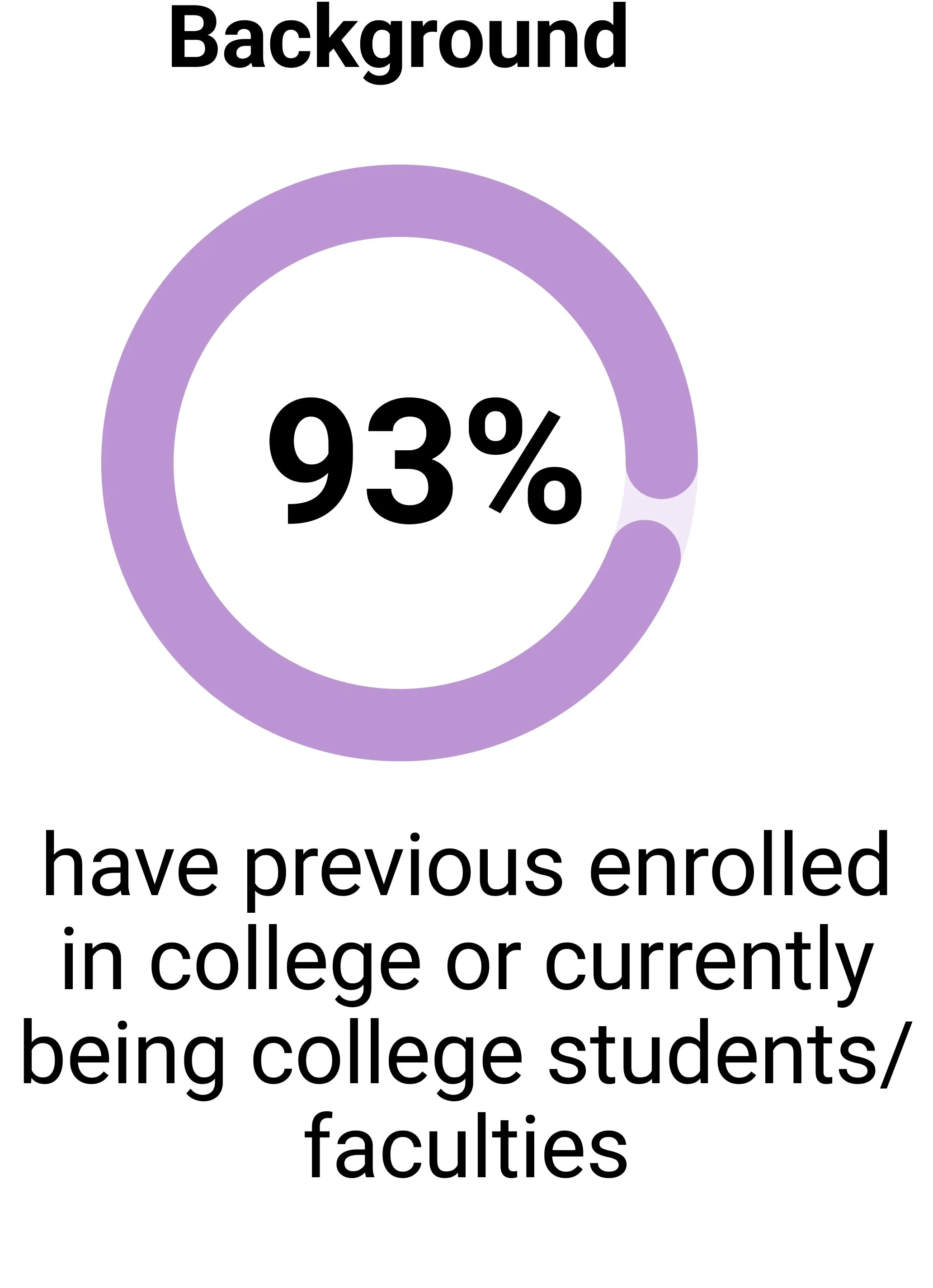
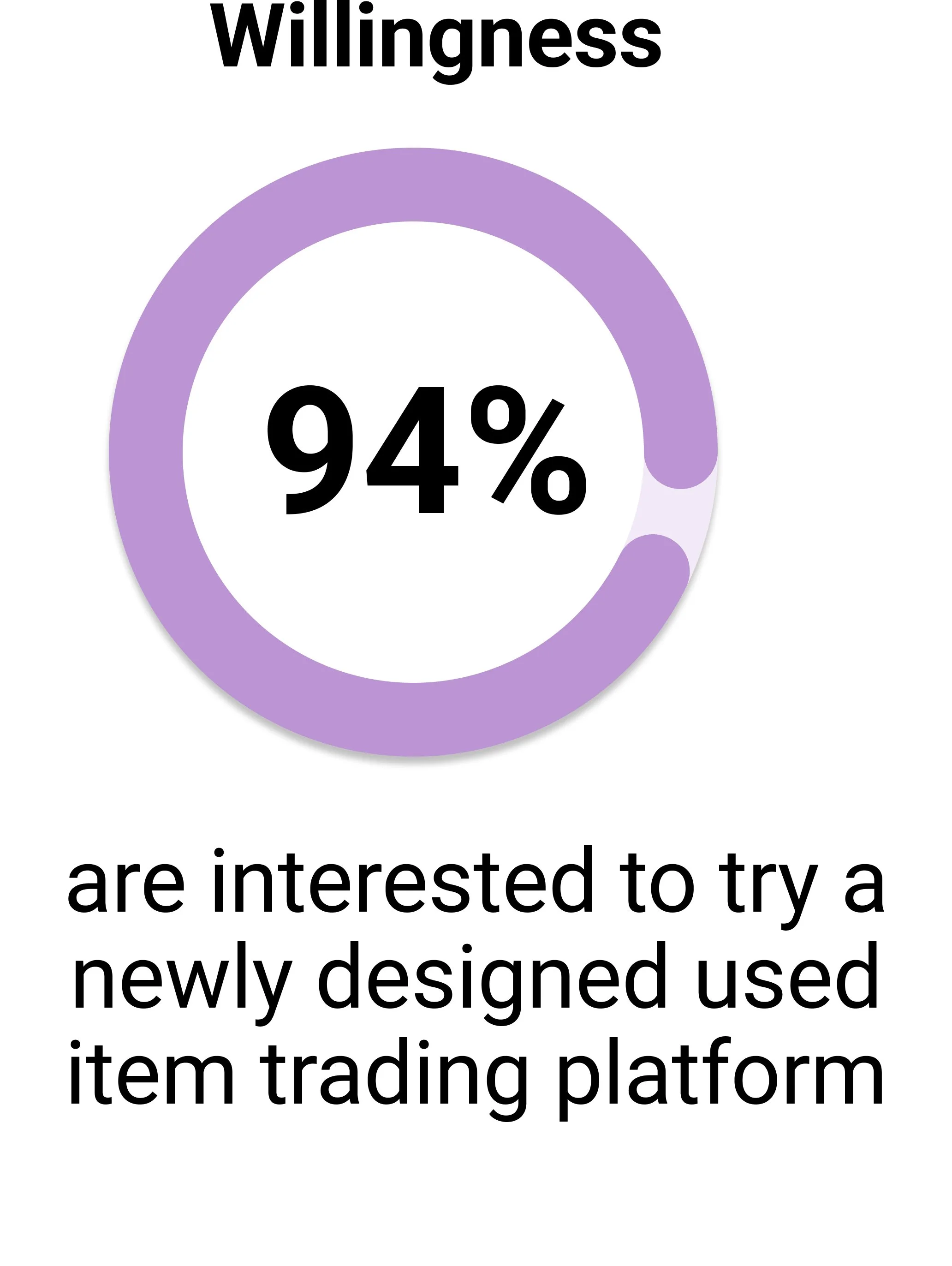
After the competitive analysis, we defined our research strategy and objectives. Understanding the college students and faculty's need for selling and purchasing school-related used items is our goal.
First, we built an online survey and shared it among students and faculties in the University of Washington, Seattle. In just a few days, we received over 50 submissions.
Interviews
We conducted user interviews to build new personas and to inform the design. Together with the team, we prepared an interview script with 10 questions, focusing on users’ intention on buying used items, frequency of buying used items, and their pain points relating to the whole experience. In 5 days, I recruited and interviewed 5 users remotely. We referenced the user interview findings throughout the entire design process. Here are several key questions we asked during the interview process.
Do you know what a used item trading platform is?
Why do you use used item trading platforms to shop?
If there’s one target for college students/faculties, what do you think about it?
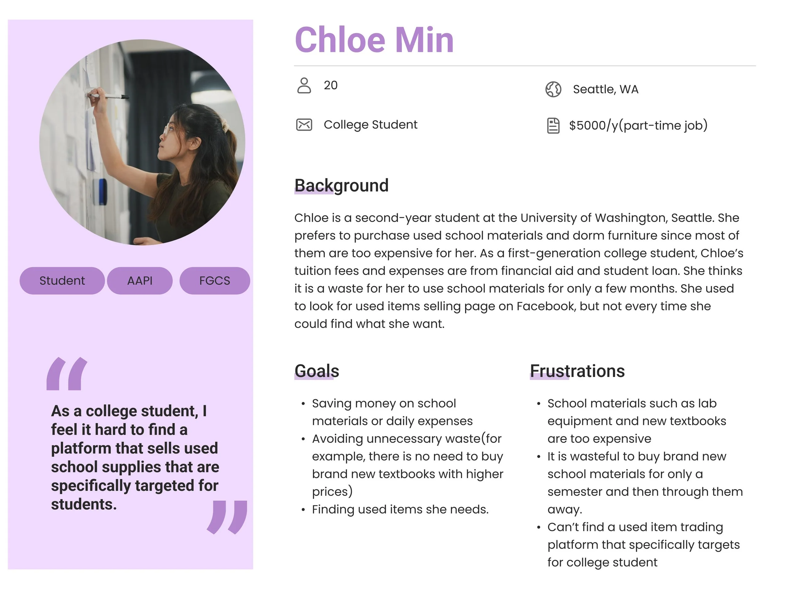
Personas
Based on the insights from the survey and interview results, we created 2 personas for each of our user segments. We used these personas whenever we wanted to step out of ourselves and reconsider our initial ideas.

Starting From Paper Sketch✏️

Low-Fidelity Prototyping
Mid-Fidelity Prototyping


Based on our findings, we identified common pain points, which lead us to the interview step.

The main insights
Theme 1: User Targeted 👤
Theme 2: Community Targeted 🏠


Hierarchy Task Structure Model (HTI)
Before starting prototype, we created the basic Hierarchy Task Model for understanding the workflow of our app.

Improvements through user testing


Based on the Lo-Fi Prototype, we drafted out the Mid-Fi Prototype with a clear flow direction for each function on the bottom navigation.
1. Main flow for buying an item from home page.
2. Main flow for messaging a follower/viewing follower’s status.
3. Main flow for viewing the user’s profile page.
4. Main flow for selling an item.
The paper sketch helped us to have a basic understanding of the main flow of our shopping app. We also confirmed the four main buttons we want to set up for the navigation bar: Home, Messaging, Selling, and Profile.
Based on user testing results, we recreated the Category label by inserting them in the middle of the page (1) and displaying items under the category directly underneath (2).
This help the users have access to the products in one step instead of two.
1. Category Page Redesign
2. Adding contact information of the seller and adjusting UI’s location
We changed the location of the shopping cart and wish list for better usability. (1, 3)
Also, the seller’s contact info being included if buyers want to contact the seller in the first place. (2)
The Final Product


⬅️ You can visit the final prototype in Figma by clicking here!
⬇️Here is a short 1:40 minutes video for guiding through the entire user flow.
Conclusion & Reflection
This is our first team UX project and all of us started with zero experience. We are grateful for every team member’s contribution to this amazing app here are a few points we want to think about:
Ubiquitous: Since this is a class project we did for the University of Washington, we focused most of our user research and even design interface on UW. However, what should we do if the client is from another institution? We should consider the design elements to be more universal if we are going to redesign the project.
User testing: Due to time limitations, we only performed one round of user testing. Because of user testing, we can find out the problems and enhance the user experinece.
Accessibility: We need to think about the inclusive design part to make the product more accessible.